logo & slogan
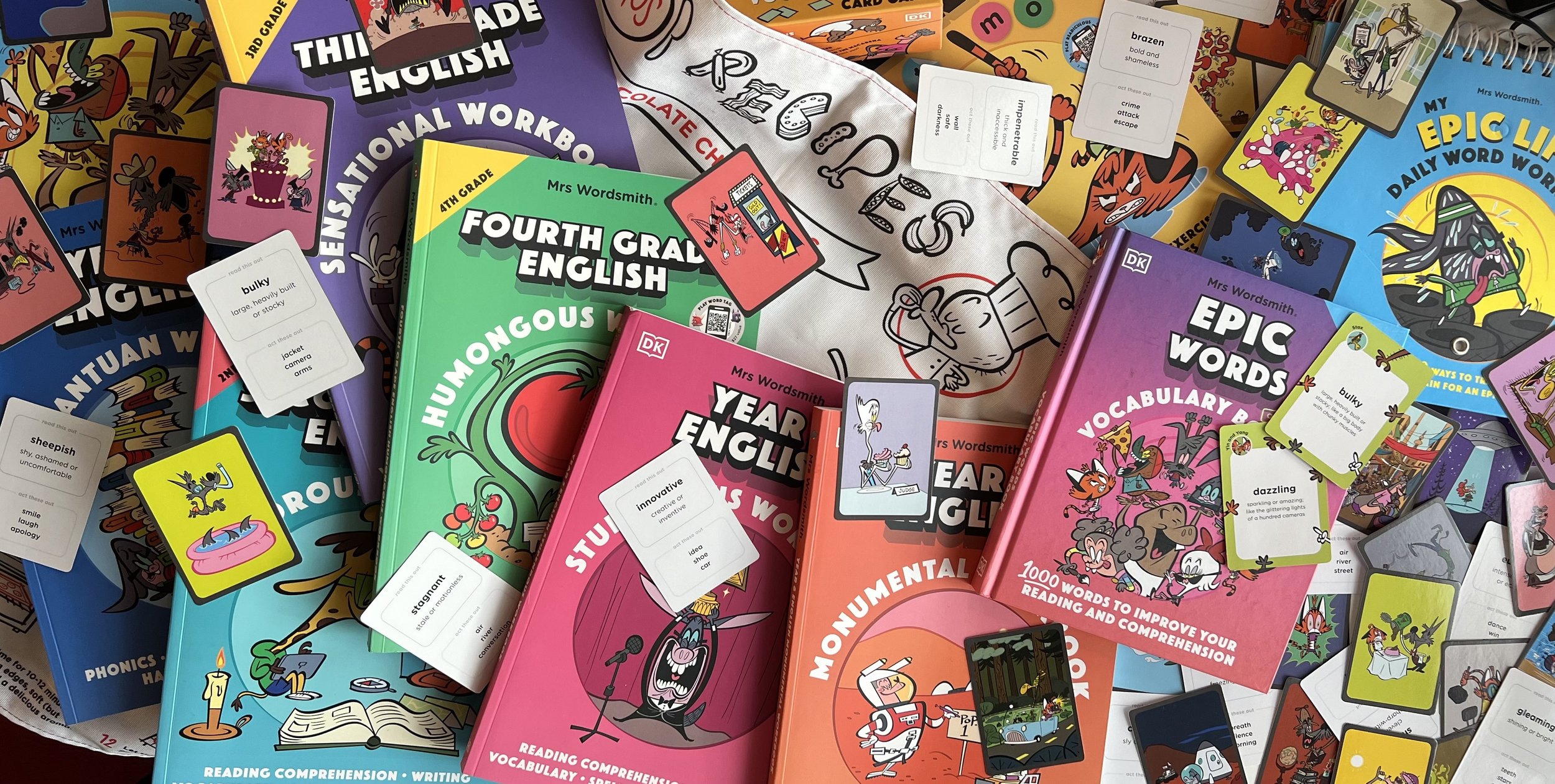
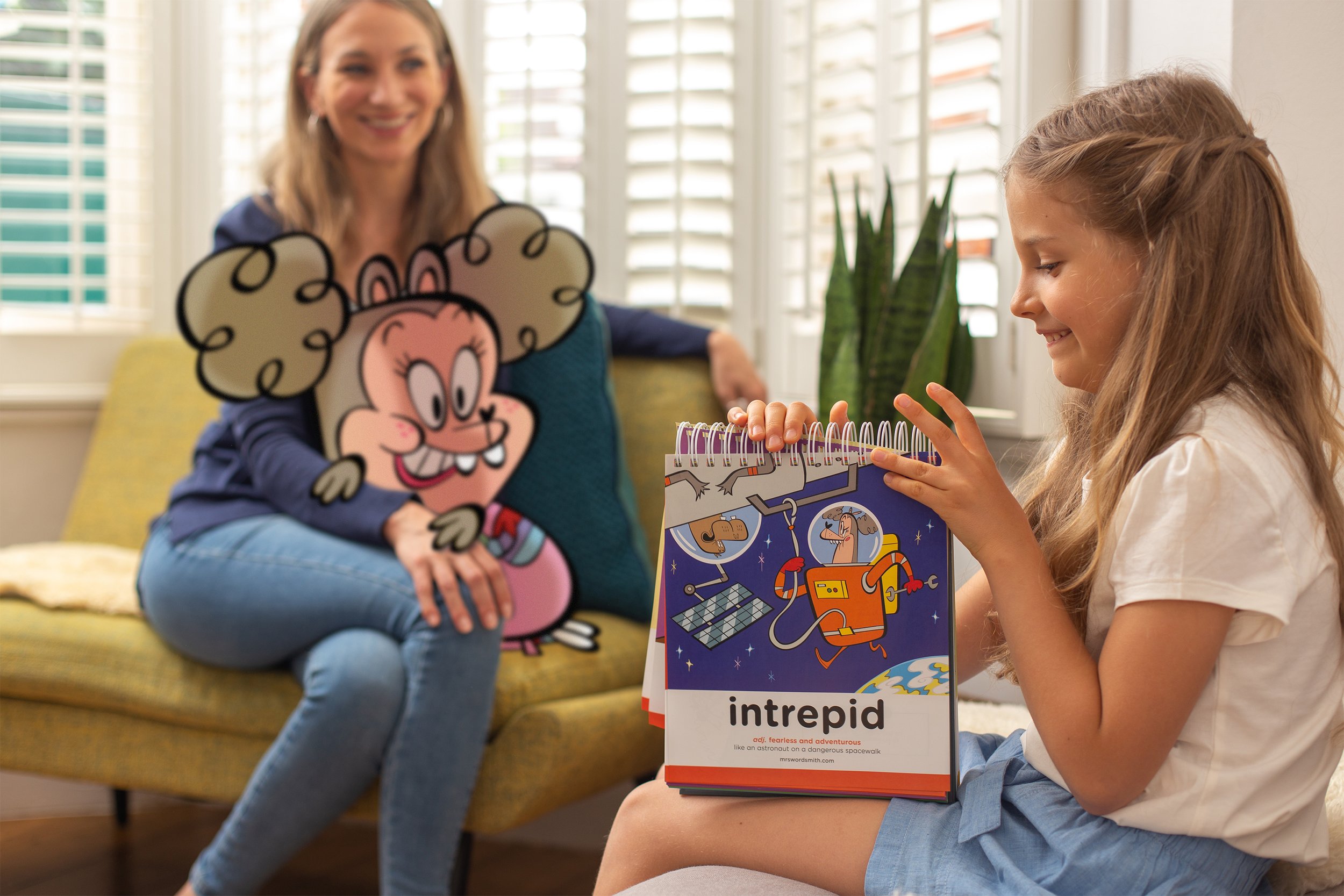
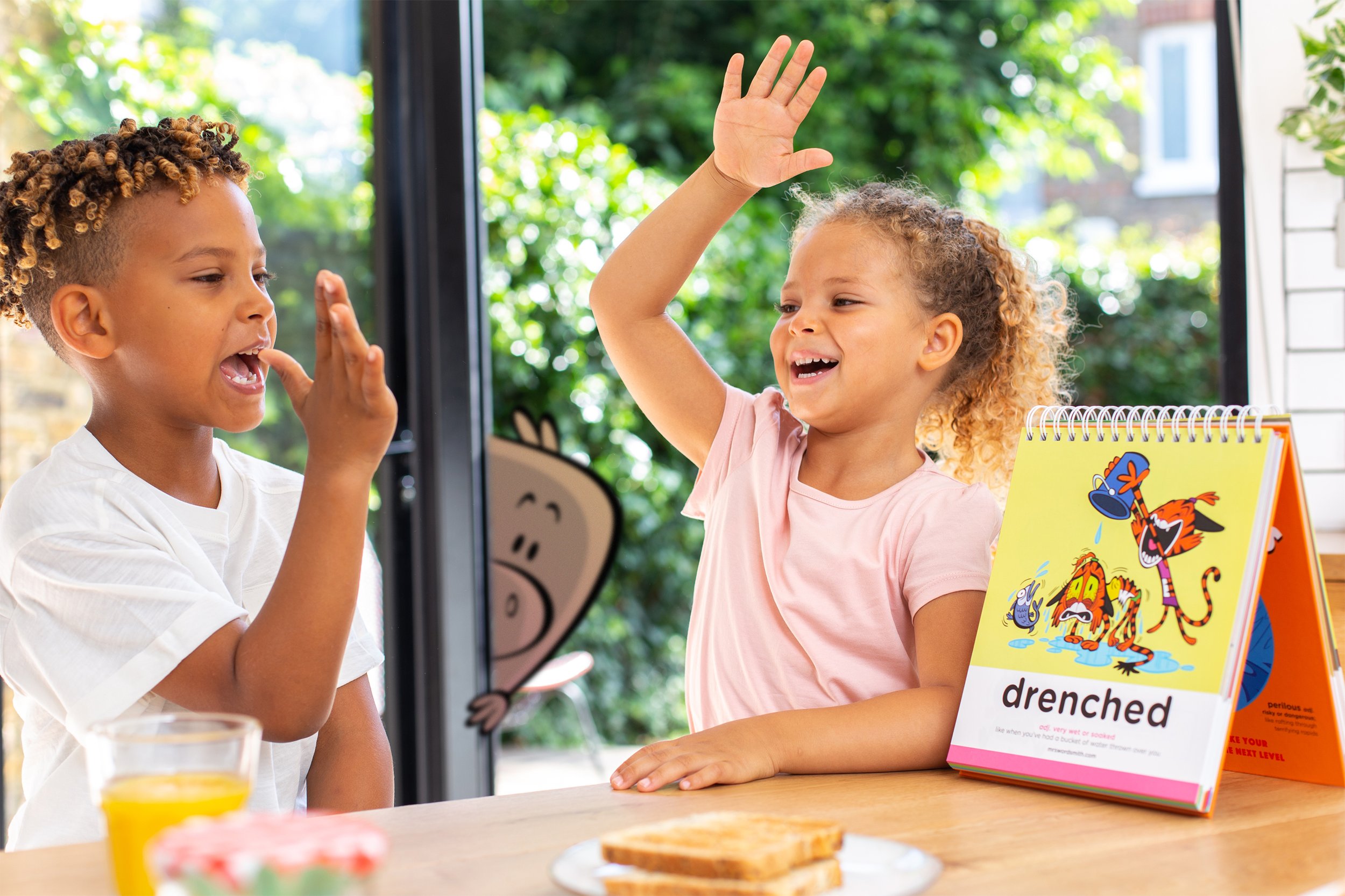
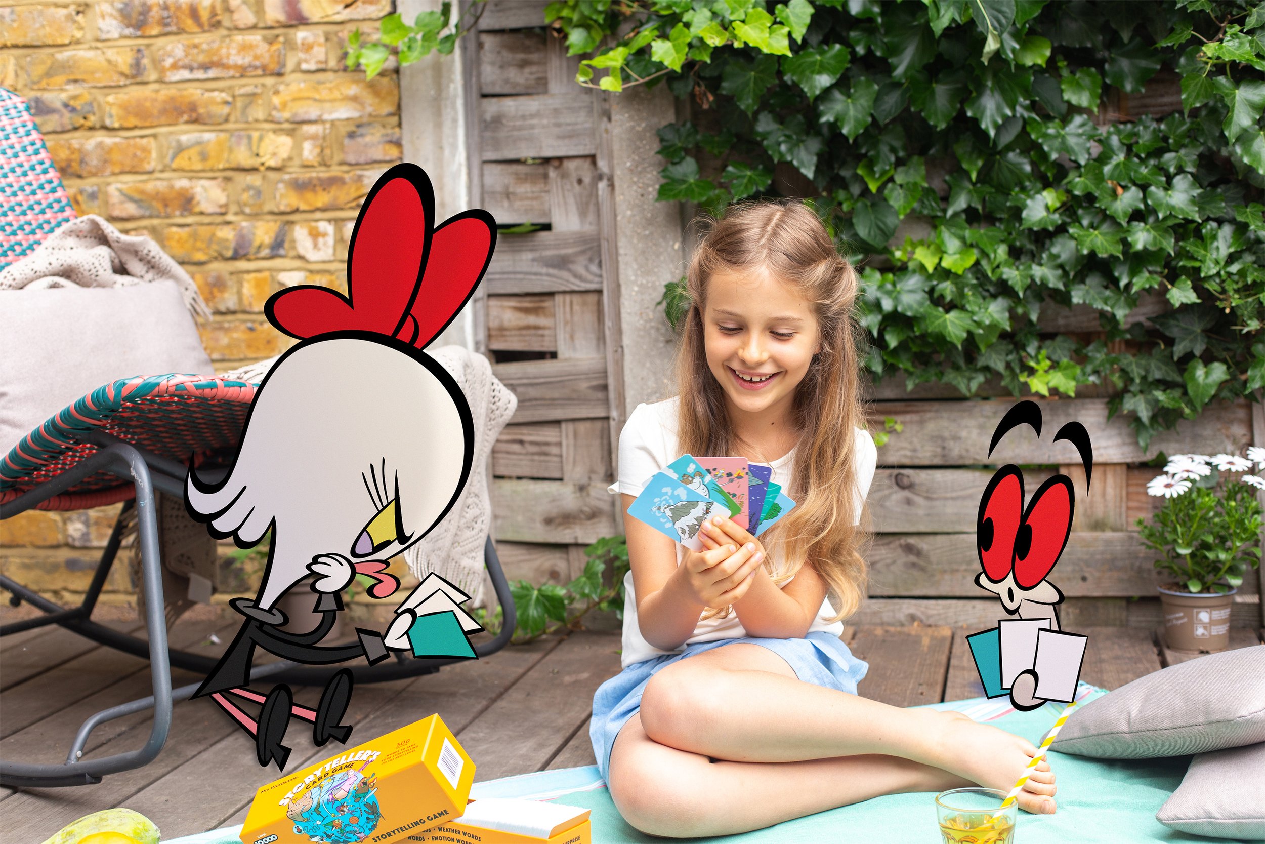
Mrs Wordsmith is a company that aims to make learning hilarious, effective, and riotously fun. It does so through books, card games, apps and videogames.
In refreshing the image of the company my intention was that of creating a logo that would simultaneously scream ‘language’, ‘cartoon’ and ‘fun’ - all in a simple shape that would be iconic and clear for all generations interacting with the brand. In close collaboration with the head of design, James Sales, we drafted the new balloon circling the letter ‘w’, all executed in a black stroke akin to the house illustration style.
Short, mighty and concise, the company’s slogan had to convey the brand mission to create entertaining and empowering educational content.
In four words, we made it absolutely clear that at Mrs Wordsmith learning happens through laughter, a powerful reminder for customers as well as the team crafting the products.

a playful website
Wanting for the website to feel warmer, funnier and less of an e-commerce, we implemented a few changes that would convey the personality of the brand to the people visiting the site.
First we introduced an animated character page that would explore and show off the big cast of characters created by Craig Kellman. Then we started peppering the product pages with “mock reviews” - as if the cast of wild animals were leaving their opinions on the products. We sprinkled a few animations left and right and then we finished it off with a set of rotating footers, one for each season.

a fun approach to social media
With a team of illustrators, designers and writers working full time at Mrs Wordsmith, the approach to social media can go from low to high effort according to the occasion. At times a product photo will do the job, while others an entire series of illustrations will be produced. On occasions such as Black History Month, World Ocean Day or National Reading Month the team was ready to deliver incredible content, animated or static, to wow our followers.


